
Client:
UISP & PLV Hitball
UISP & PLV Hitball
Tasks:
Brand strategy
Brand identity
Art Direction
Brand identity
Art Direction
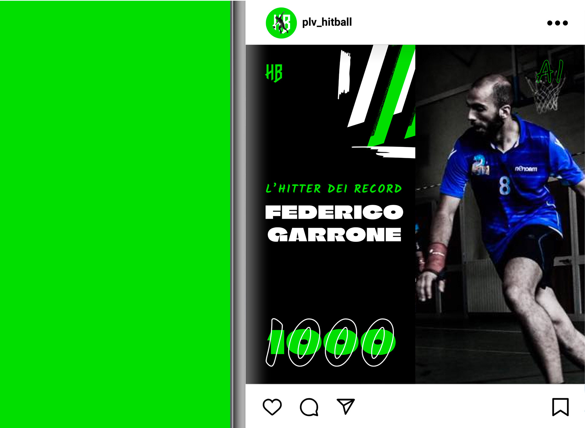
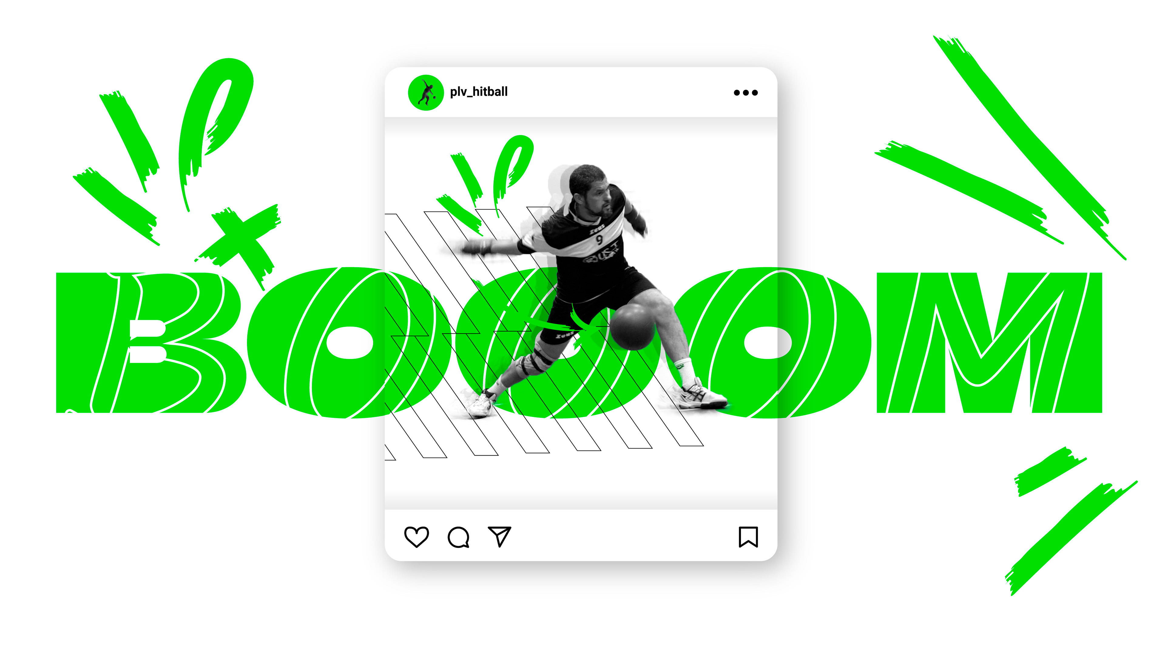
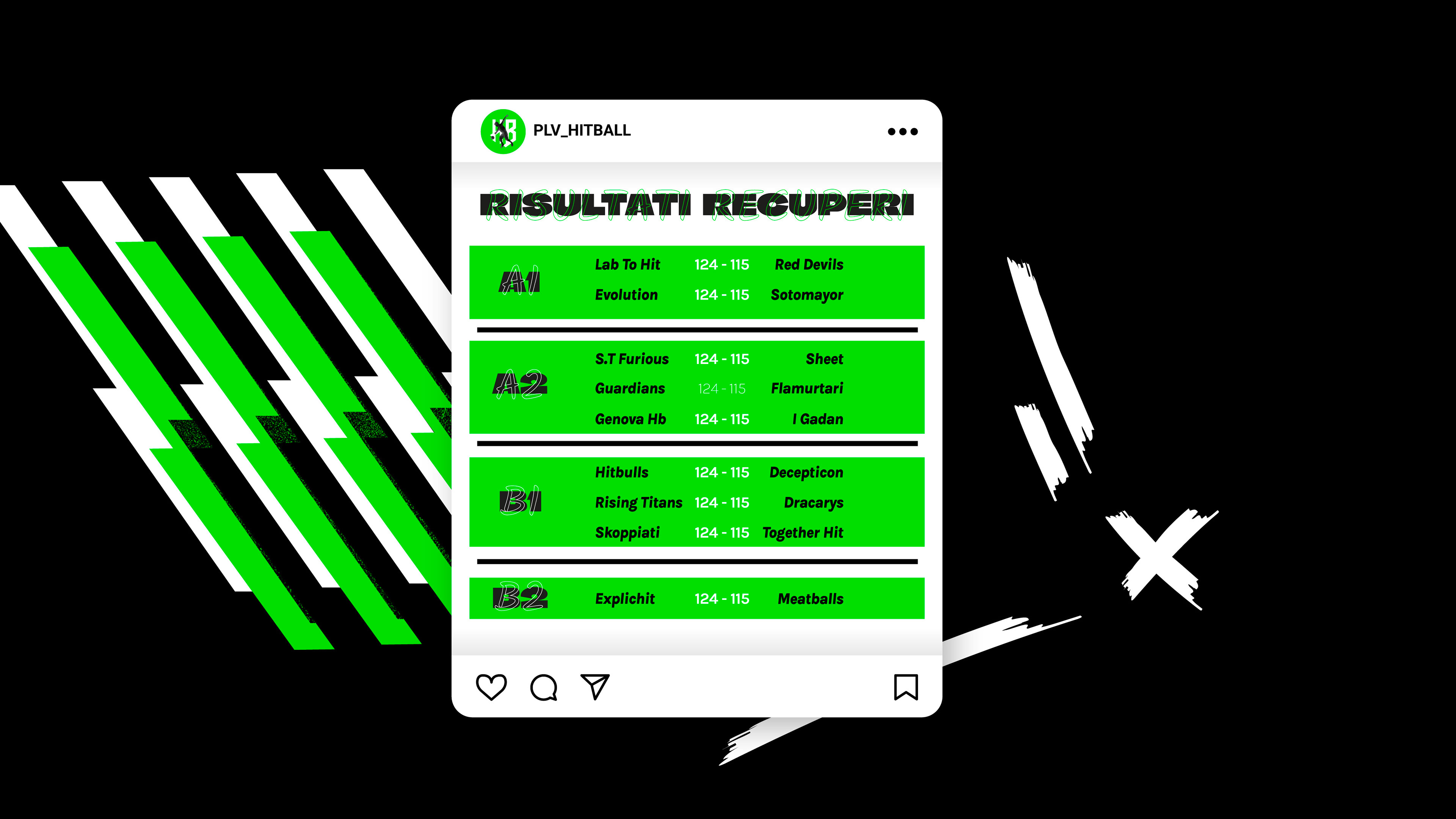
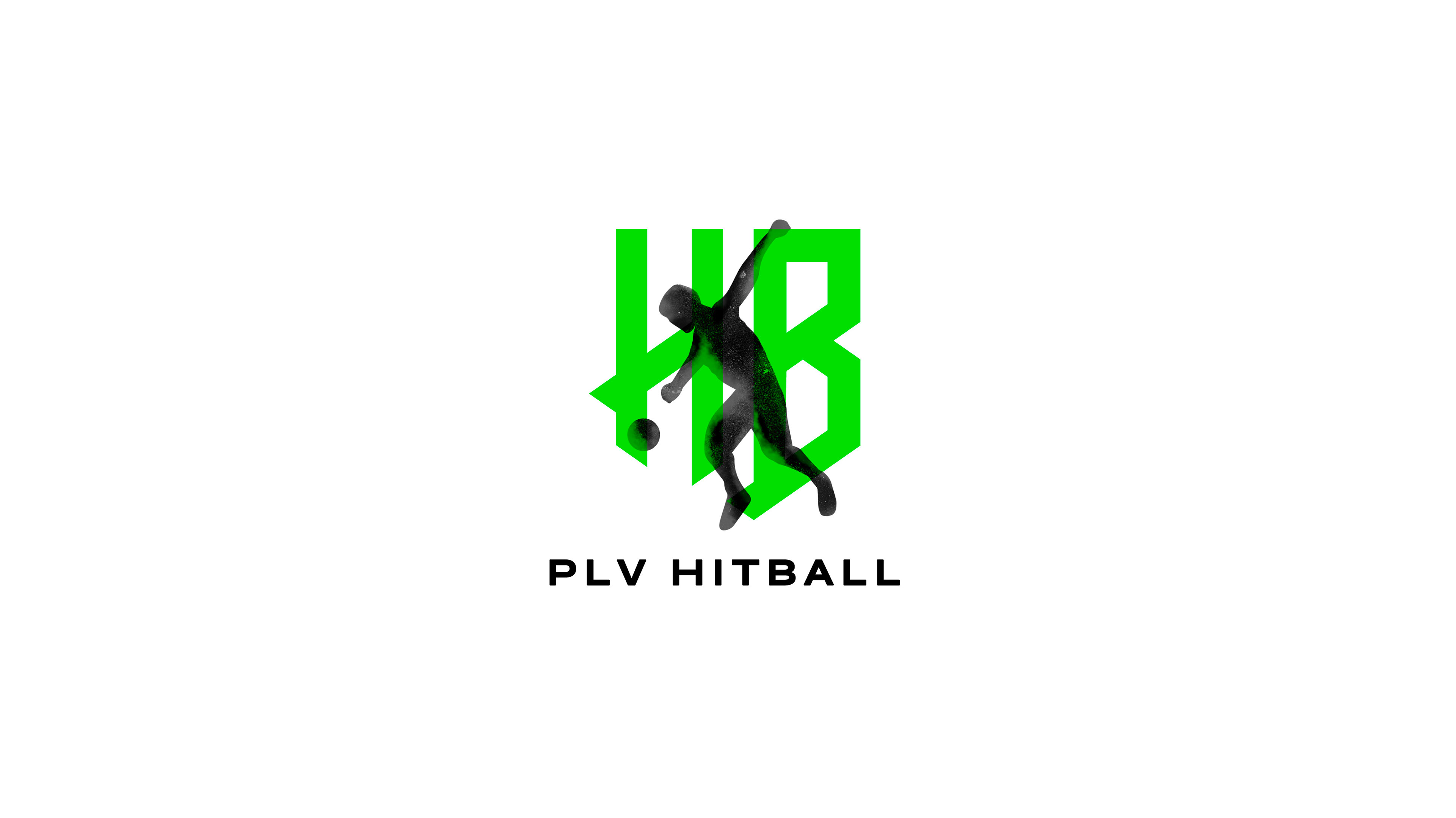
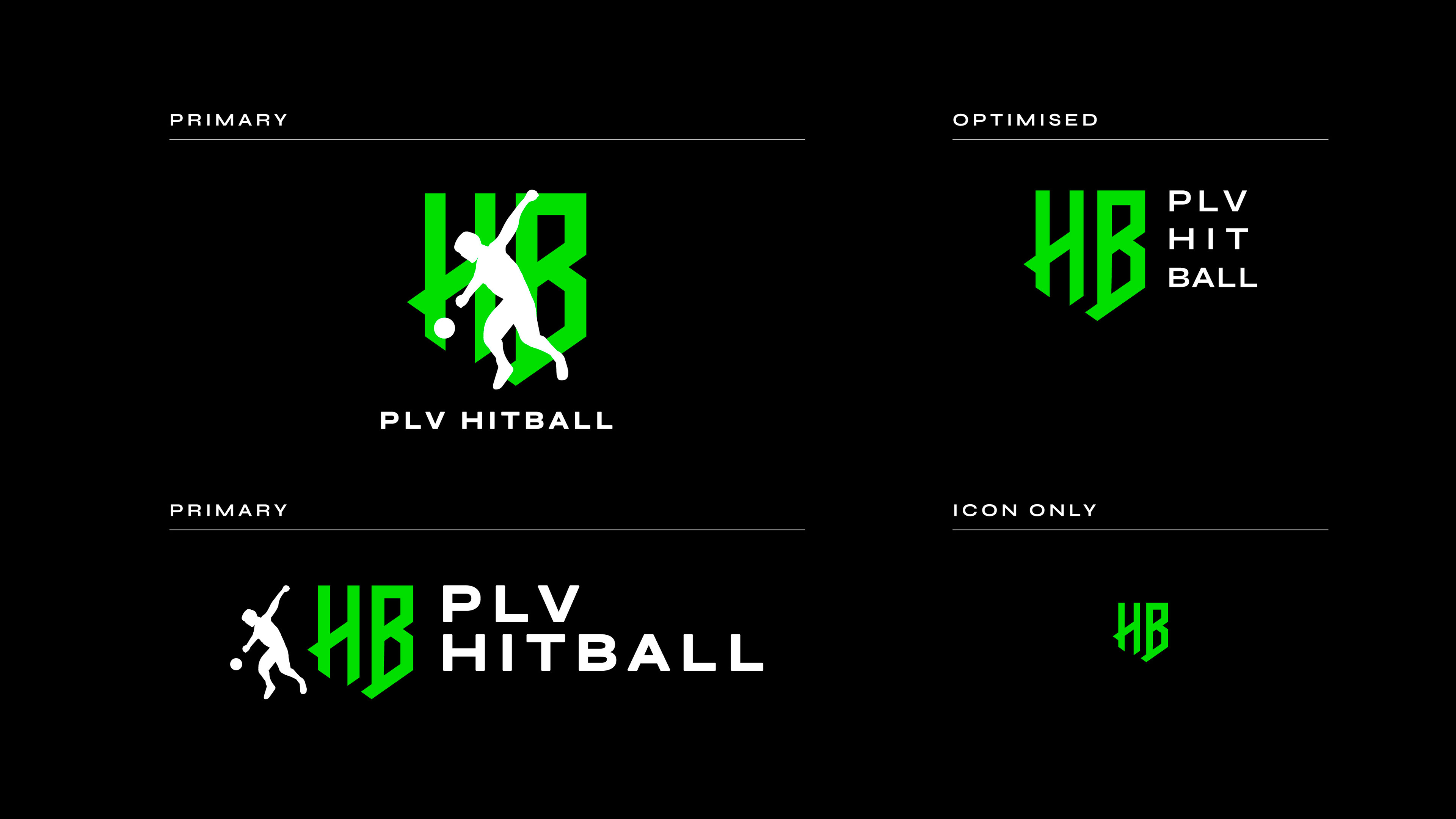
With PLV Hitball, we embarked on an journey to craft a vibrant brand identity that captures the essence of this dynamic sport. Through meticulous design and strategic planning, the brand has been infused with energy and charisma, reflecting the volcanic nature of hitball.
But the new brand identity is more than just colors and logos; it's a representation of their values and commitment to this sport. Every element, from the logo to the marketing materials, exudes dynamism and excitement, fostering a sense of unity and pride among our community.
-
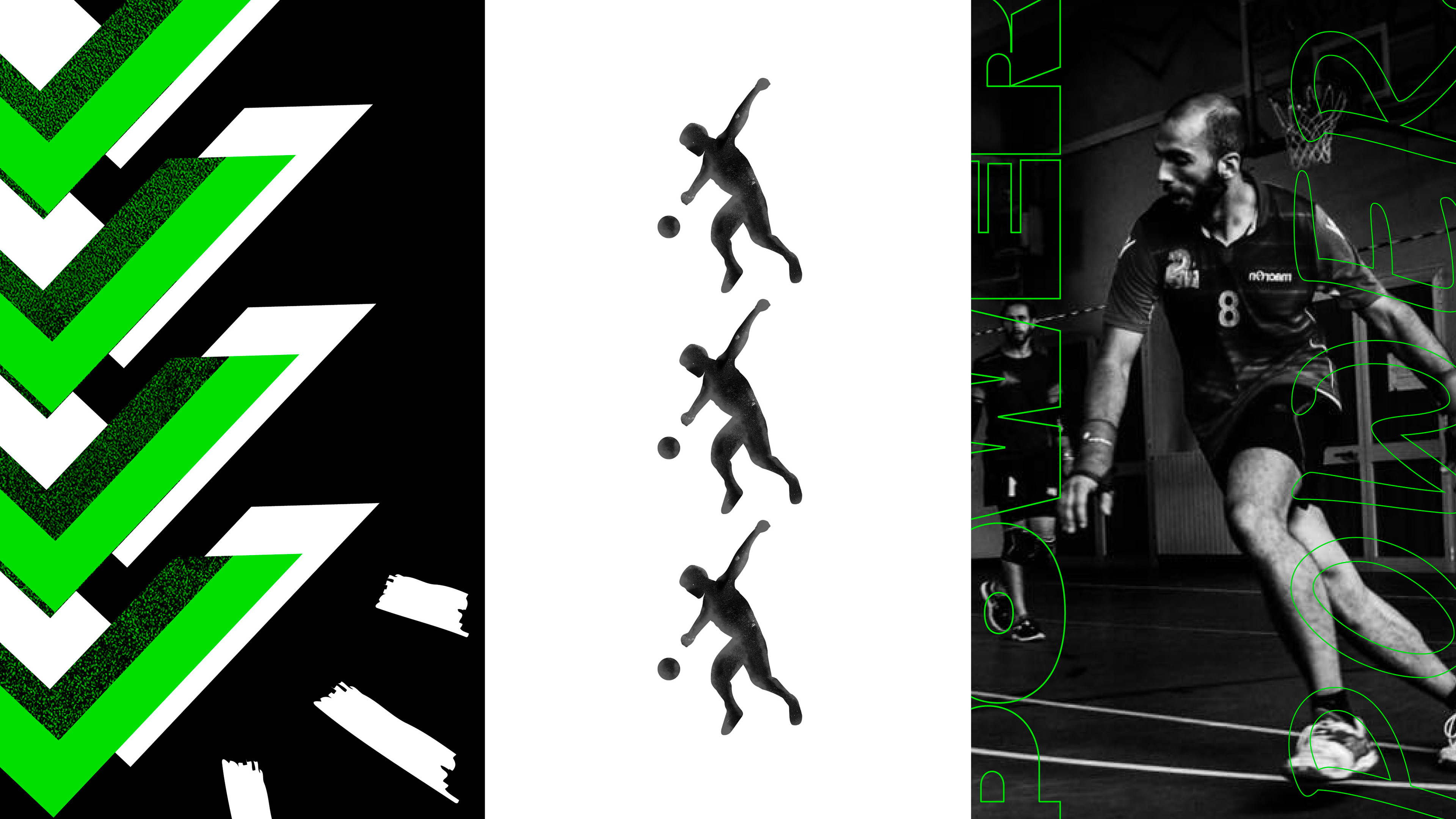
Moodboard and colors
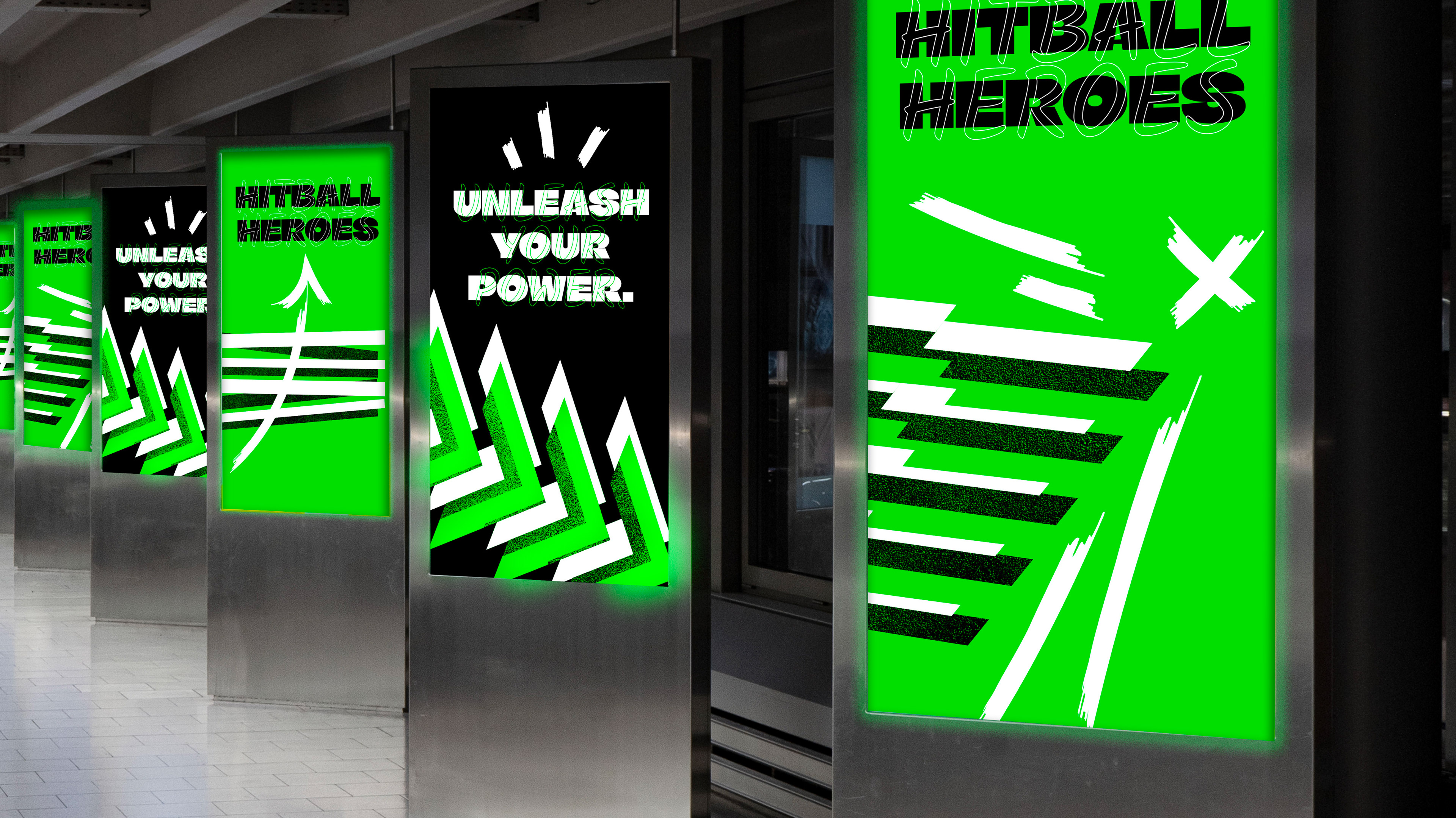
The new color palette pulsates with strength and vitality, echoing the intensity of the game itself. Bold hues dominate, symbolizing the passion and determination of the players on the court. From fiery black to electric green, the colors command attention and convey the spirit of competition.
-
The rebranding aims to attract new players and fans to the sport by showcasing its excitement and energy. With vibrant colors and dynamic branding, we're inviting individuals to experience the thrill of hitball firsthand and join our community.